
The fervor surrounding Apple’s latest unveiling at the Worldwide Developers Conference (WWDC) 2025 has reached new heights, particularly with the introduction of the Liquid Glass design language. This ambitious endeavor seeks to imbue all Apple devices with an aesthetic that mimics the elegance of glass combined with the fluidity suggestive of liquid. At first glance, this innovative appearance might seem enticing, but a closer look reveals that it is a double-edged sword. The bold visual changes encountered in iOS 26 represent both a significant evolution in design philosophy and a potential pitfall for user experience.
The Aesthetics: Beauty Meets Functionality
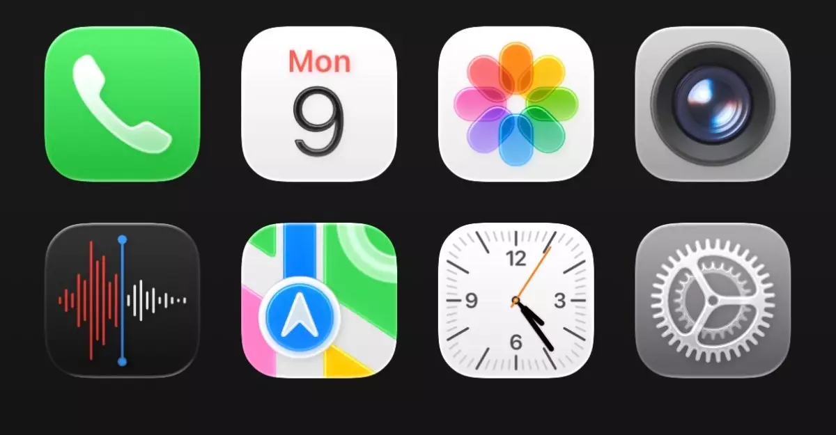
Liquid Glass aims to redefine how users interact with their devices by creating an interface that feels both modern and elegant. The shimmering, semi-transparent layers introduced over elements like app icons and tab bars give off an illusion of depth, an effect that Apple has masterfully embedded within its design ethos over the years. One feature that stands out distinctly is the way these icons seem to float above the background wallpaper, enhancing visual immersion and accessibility.
However, while the theory sounds compelling, the practical implications raise eyebrows. Users often appreciate a user interface that is not only pleasing to the eye but also functional and easy to navigate. Herein lies a potential flaw—while Liquid Glass draws users in with its highly stylized appeal, it struggles with clarity in key operational areas, particularly where readability and intuitiveness are concerned. As engaging as the aesthetics might be, it is easy to forget that functionality drives user satisfaction.
A Jarring Initial Experience
First impressions can be pivotal, and the initial encounter with Liquid Glass can indeed be shocking. The dramatic shifts from previous iterations, particularly—let’s say—even in a grayscale home screen, can leave users feeling disoriented. This is especially true in functional areas like the Control Center, which at times exhibits an overwhelming clutter due to excessive transparency. Users looking for quick information might find themselves frustrated rather than pleased as they navigate through a maze of gleaming icons that lack immediacy and clarity.
Design elements like the bubbled icons and new animations—while spirited in their execution—add layers of complexity that might not resonate well with all users. The transition effects such as the droplet animation within the Clock app may seem visually attractive but would require a total overhaul of user expectations concerning speed and efficiency when navigating apps.
An Uneasy Balance
As with any radical design overhaul, the delicate balance between aesthetics and usability must be carefully considered. This is where Apple’s reputation for meticulous attention to detail will be put to the test. While the broader design philosophy might align with modern trends toward translucency and depth, it does so at the risk of user experience taking a backseat. The spacing issues in menus and the generally overwhelming visual noise are significant indicators that the Liquid Glass may need further calibration.
Apple’s history is rich with UI changes, and while many have been broadly accepted over time, some—such as the early iterations of iOS 7—were met with criticism. Current sentiment from early users of Liquid Glass suggests a potential for similar backlash if further refinements are not forthcoming before the launch of iOS 26 later this year.
The Future: Pragmatic Optimism
Despite the challenges presented by Liquid Glass, there remains a sense of hopefulness about the future of this initiative. Apple has demonstrated a willingness to listen to user feedback and adapt accordingly, so it is reasonable to expect enhancements that will address current concerns. The prospect of enjoyable updates and improved visuals that retain both beauty and functionality leaves room for optimism amongst the tech community.
With the anticipated evolution of Liquid Glass and the potential amendments to its less favorable aspects, there exists a golden opportunity for Apple to not only engage users but also redefine their relationship with technology through compelling interface innovations. In doing so, it can pave a more seamless transition into this bold new era of design.