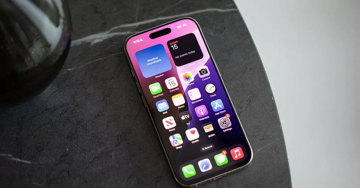
As someone who has navigated the world of smartphones for over a decade, it’s impossible to overlook the familiar but increasingly confining grid of app icons on devices like the iPhone. This grid, once a symbol of organization and accessibility, can start to feel like a cluttered prison, where the sheer volume of icons and notifications becomes overwhelming. Instead of providing clarity, these rows of ever-present apps prompt constant distractions as they battle for attention. In my case, I look at sixty app icons on my homescreen alone, a far cry from the ten or so apps I once managed seamlessly.
The tension between usability and clutter in mobile interfaces is not a new phenomenon. While Android systems have long offered solutions like app drawers and customizable launchers, allowing users greater freedom and organization, iOS lags in ease of customization. The introduction of widgets and the app library with the release of iOS 14 hinted at a much-needed shift, yet many users, including myself, often default to familiar patterns. Fast forward to the current iOS 18, which boasts even more freedom in arranging apps and widgets, yet many of us still cling to the old ways, dictated by early smartphone habits.
Recognizing the inefficiencies and frustrations of my grid-laden homescreen, I decided to take matters into my own hands. I embarked on a mission to purge and refine my app organization, driven by the realization that many of the apps occupying prime space weren’t necessary for my day-to-day life. Instead of allowing apps I seldom use to clutter my screen, I devoted an hour to decluttering my device, a process enlivened by the prospect of a more minimalist and functional interface.
By the end of my digital overhaul, I had managed to reduce my app icons to just four essentials in the dock while artfully arranging a selection of widgets. I affectionately dubbed this new setup “Windows Phone 2.0,” a nod to an era when simplicity and functionality reigned. Surprisingly, the initial anxiety of leaving behind familiar icons quickly morphed into a sense of liberation. I discovered that the vast majority of the time, I could find what I needed through Siri’s suggested apps or simply by typing the app name, further reinforcing the notion that I didn’t need a constant visual reminder sitting patiently on my homescreen.
One notable consequence of this new digital lifestyle is the evolution of how I interact with notifications. In the past, my homescreen cluttered with app icons prompted me to confront notifications daily, often resulting in compulsive behaviors to eliminate red badges at all costs. I was constantly drawn back into apps that weren’t necessarily vital to my productivity, merely to achieve “badge zero.” Now, with fewer icons in view, notifications linger quietly, easily forgotten until I actively search for them. While this can lead to missed alerts, I appreciate the reduced pressure of constant reminders, a welcome trade-off for a more serene experience.
My colleagues also illustrate varying approaches to optimizing the app grid. For example, Wes Davis, our weekend news editor, has embraced an even more radical approach by prioritizing functional widgets over app icons, thus minimizing distractions from applications that could otherwise derail productivity. By employing grayscale icons, Wes has expertly curved visual over-stimulation while seamlessly organizing tasks. Similarly, news editor Jay Peters strives for simplicity, allowing only a select few apps visible at any time, promoting a balanced digital interaction devoid of the chaos typically induced by excessive icons.
The experiences shared by myself and my colleagues paint a compelling picture of the evolving relationship we have with our devices. The digital landscape is rife with distractions, but it’s reassuring that many find solace in customizable solutions that help prioritize functionality over sensory overload. It’s clear that the way we set up our homescreens can significantly impact our digital lives—suggesting that less truly can be more.
Ultimately, as technology continues to grow, so does the potential for our devices to adapt with us. Whether through more personalized AI suggestions or innovative interface changes, there’s hope for the future of our digital environments. For now, however, as I navigate this newly established off-grid lifestyle, I am reminded that personal discipline and a desire for simplicity can reclaim our attention from the noise of digital life, guiding us toward a more focused and productive experience. Thus, it becomes imperative to continuously evaluate our app usage and homescreen setups, discovering what truly serves us and what simply occupies space.

